Revolver Double Page Spread Design v.2
Revolver Double Page Spread Design v.2
Revolver Double Page Spread Design v.2
Client
(unofficial) REVOLVER
Year
2021
Category
Editorial Design
Research
Research
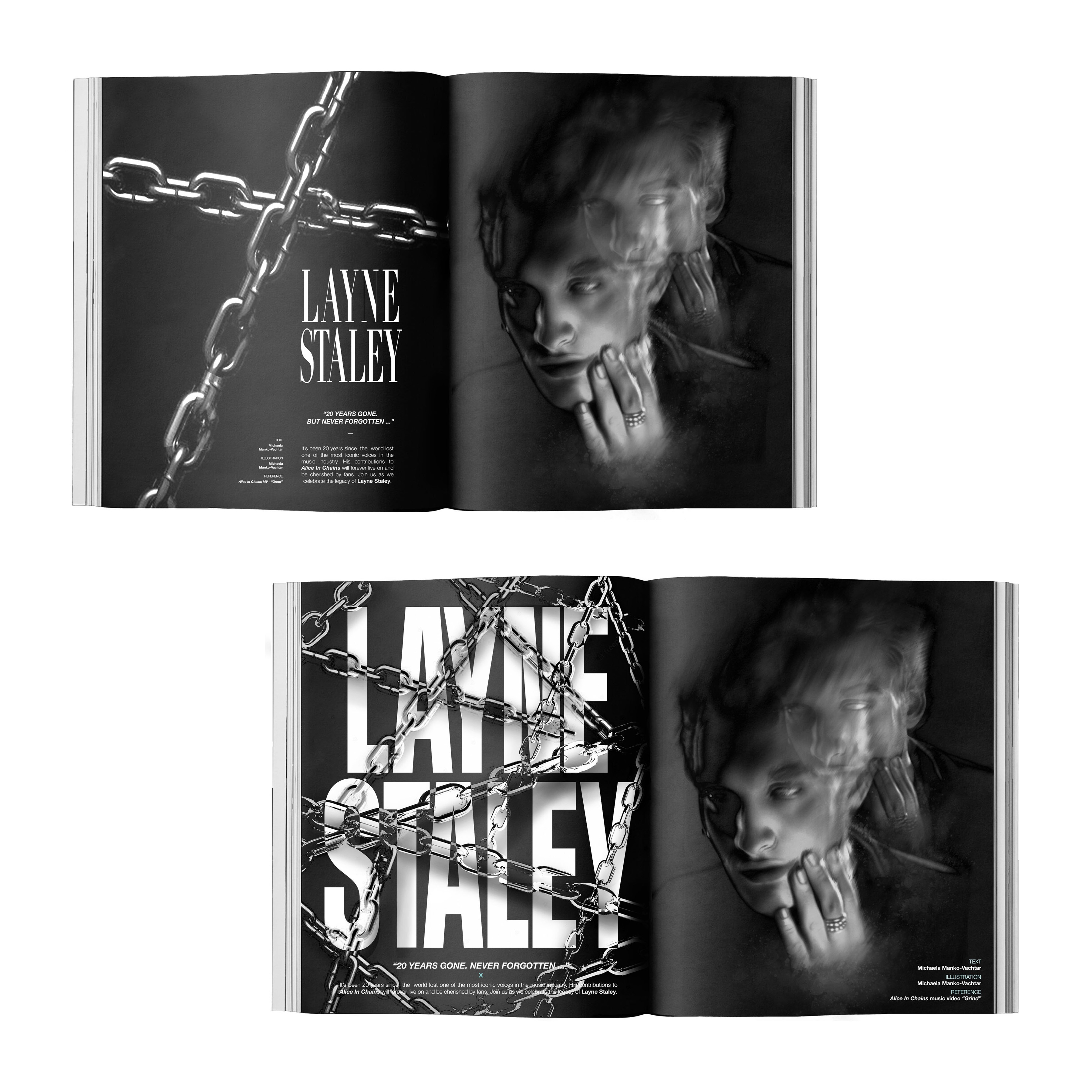
For the double-page spread featuring Layne Staley in REVOLVER magazine, research was conducted to capture the essence of Staley's legacy and REVOLVER's editorial style. Studying REVOLVER's past issues helped understand its layout, typography, and visual themes, ensuring alignment with the magazine's aesthetic.
Inspiration was drawn from Staley's iconic imagery, including references from Alice In Chains music videos such as "Grind," to convey his role in the band and his enduring influence. The use of metaphorical elements, such as chains, was explored to symbolize Staley's artistic contributions and the bond with his bandmates.
Throughout the research phase, attention was paid to maintaining consistency with REVOLVER's print specifications, ensuring the final spread seamlessly integrated into the magazine. The aim was to create a visually captivating spread that honored Staley's memory while resonating authentically with REVOLVER's audience.
Research
For the double-page spread featuring Layne Staley in REVOLVER magazine, research was conducted to capture the essence of Staley's legacy and REVOLVER's editorial style. Studying REVOLVER's past issues helped understand its layout, typography, and visual themes, ensuring alignment with the magazine's aesthetic.
Inspiration was drawn from Staley's iconic imagery, including references from Alice In Chains music videos such as "Grind," to convey his role in the band and his enduring influence. The use of metaphorical elements, such as chains, was explored to symbolize Staley's artistic contributions and the bond with his bandmates.
Throughout the research phase, attention was paid to maintaining consistency with REVOLVER's print specifications, ensuring the final spread seamlessly integrated into the magazine. The aim was to create a visually captivating spread that honored Staley's memory while resonating authentically with REVOLVER's audience.
Design
Design
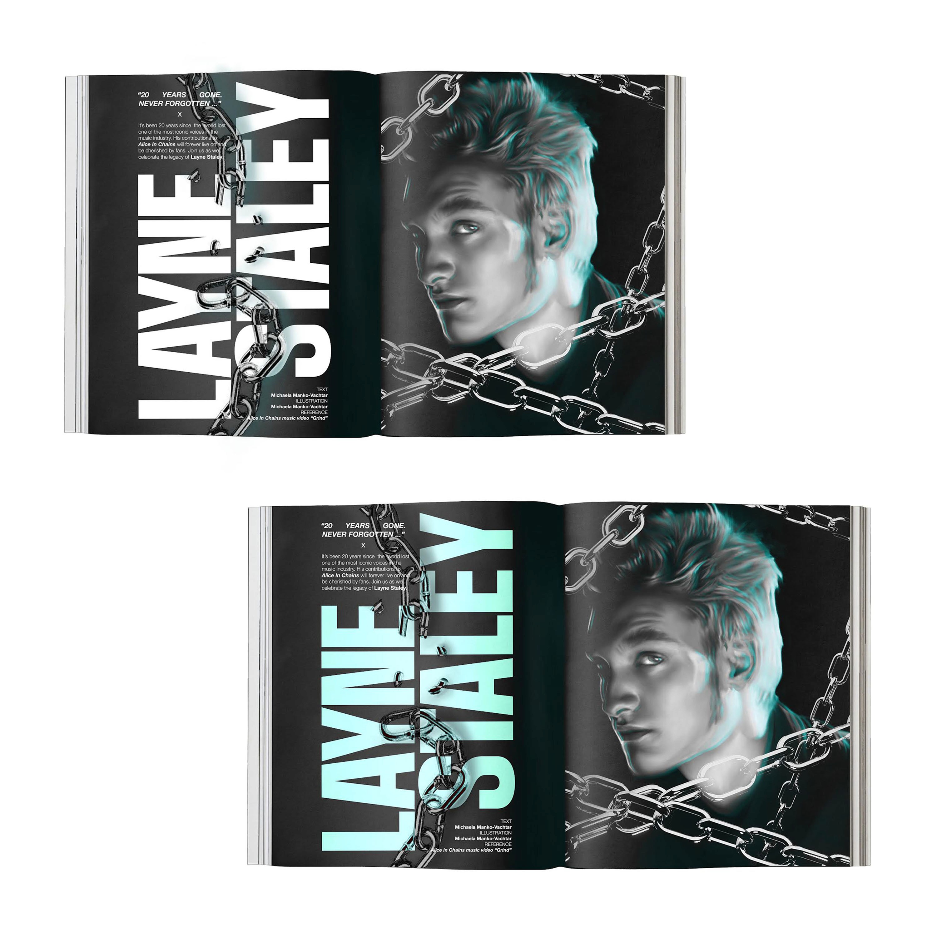
Drawing inspiration from Staley's iconic imagery, including references from Alice In Chains music videos such as "Grind," the spread captures his enigmatic persona and enduring influence. I wanted to metaphorically represent Layne Staley's involvement in the band Alice In Chains so I focused on using the imagery of chains. The layout is carefully crafted to align with REVOLVER's editorial style, featuring bold typography and dynamic visuals which were digitally painted that command attention. Overall, the design aims to honor Staley's memory while authentically resonating with REVOLVER's audience, creating a visually captivating spread that pays tribute to a rock icon.
Drawing inspiration from Staley's iconic imagery, including references from Alice In Chains music videos such as "Grind," the spread captures his enigmatic persona and enduring influence. I wanted to metaphorically represent Layne Staley's involvement in the band Alice In Chains so I focused on using the imagery of chains. The layout is carefully crafted to align with REVOLVER's editorial style, featuring bold typography and dynamic visuals which were digitally painted that command attention. Overall, the design aims to honor Staley's memory while authentically resonating with REVOLVER's audience, creating a visually captivating spread that pays tribute to a rock icon.
Design
Drawing inspiration from Staley's iconic imagery, including references from Alice In Chains music videos such as "Grind," the spread captures his enigmatic persona and enduring influence. I wanted to metaphorically represent Layne Staley's involvement in the band Alice In Chains so I focused on using the imagery of chains. The layout is carefully crafted to align with REVOLVER's editorial style, featuring bold typography and dynamic visuals which were digitally painted that command attention. Overall, the design aims to honor Staley's memory while authentically resonating with REVOLVER's audience, creating a visually captivating spread that pays tribute to a rock icon.
Development
Development
The development of the double-page spread featuring Layne Staley in REVOLVER magazine involved thorough research into Staley's legacy and REVOLVER's editorial style. From there I worked on researching REVOLVER's style, typography, and graphic visuals from current and previous issues. Afterwards I started working on some designs that reflected past issues while maintaining the integrity of the subject. I then mocked up the images and type to showcase the final design.
The development of the double-page spread featuring Layne Staley in REVOLVER magazine involved thorough research into Staley's legacy and REVOLVER's editorial style. From there I worked on researching REVOLVER's style, typography, and graphic visuals from current and previous issues. Afterwards I started working on some designs that reflected past issues while maintaining the integrity of the subject. I then mocked up the images and type to showcase the final design.
Development
The development of the double-page spread featuring Layne Staley in REVOLVER magazine involved thorough research into Staley's legacy and REVOLVER's editorial style. From there I worked on researching REVOLVER's style, typography, and graphic visuals from current and previous issues. Afterwards I started working on some designs that reflected past issues while maintaining the integrity of the subject. I then mocked up the images and type to showcase the final design.

More Works More Works
More Works More Works
Revolver Magzine Douvle Page Spread v.1
Editorial & Layout Design
2022
Revolver Magzine Douvle Page Spread v.1
Editorial & Layout Design
2022
Revolver Magzine Douvle Page Spread v.1
Editorial & Layout Design
2022
Revolver Magzine Douvle Page Spread v.1
Editorial & Layout Design
2022
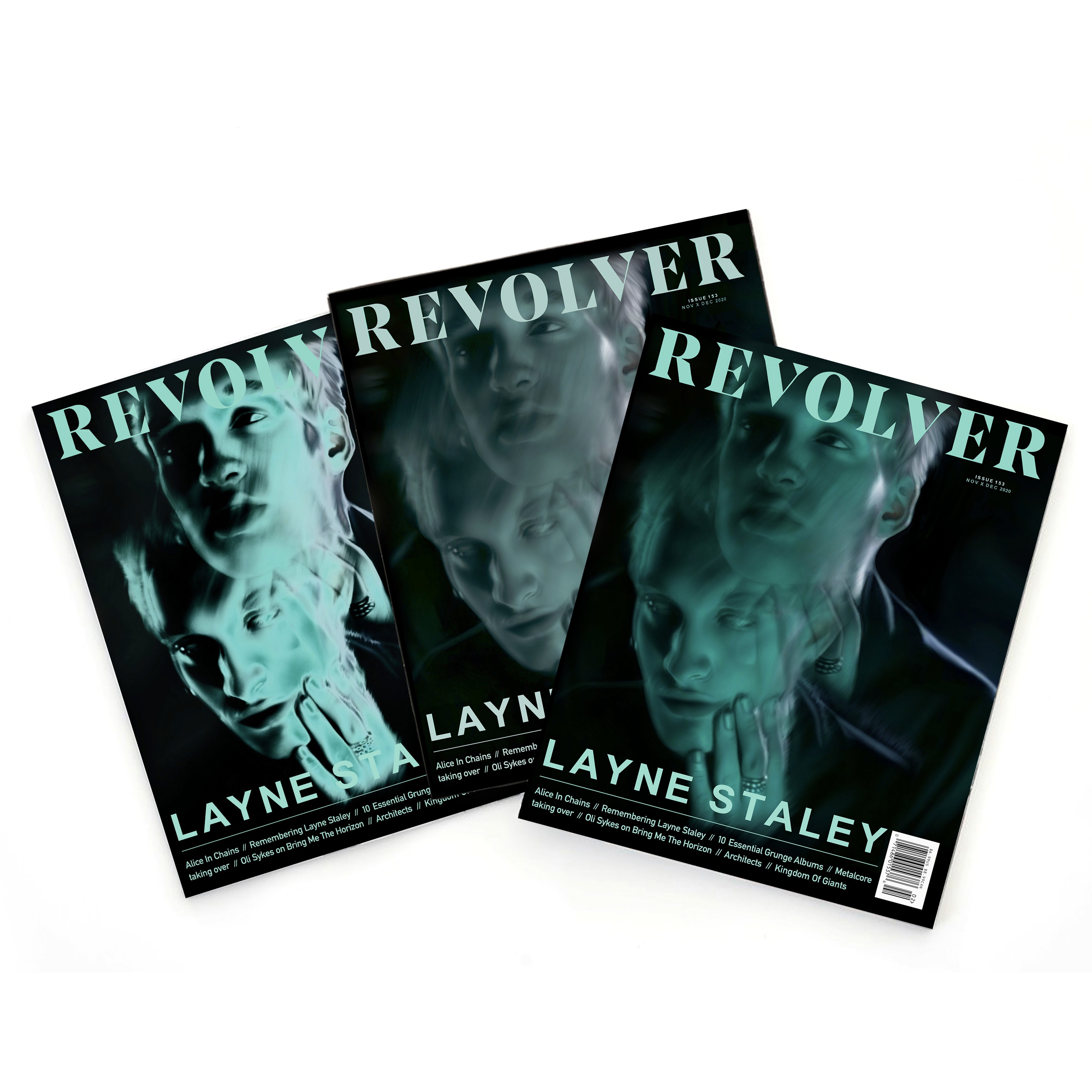
Revolver Magazine Cover Design
Editorial Design
2021
Revolver Magazine Cover Design
Editorial Design
2021
Revolver Magazine Cover Design
Editorial Design
2021
Revolver Magazine Cover Design
Editorial Design
2021
©MMV
GO BACK TO TOP
©MMV
GO BACK TO TOP
©MMV
GO BACK TO TOP
©MMV
GO BACK TO TOP