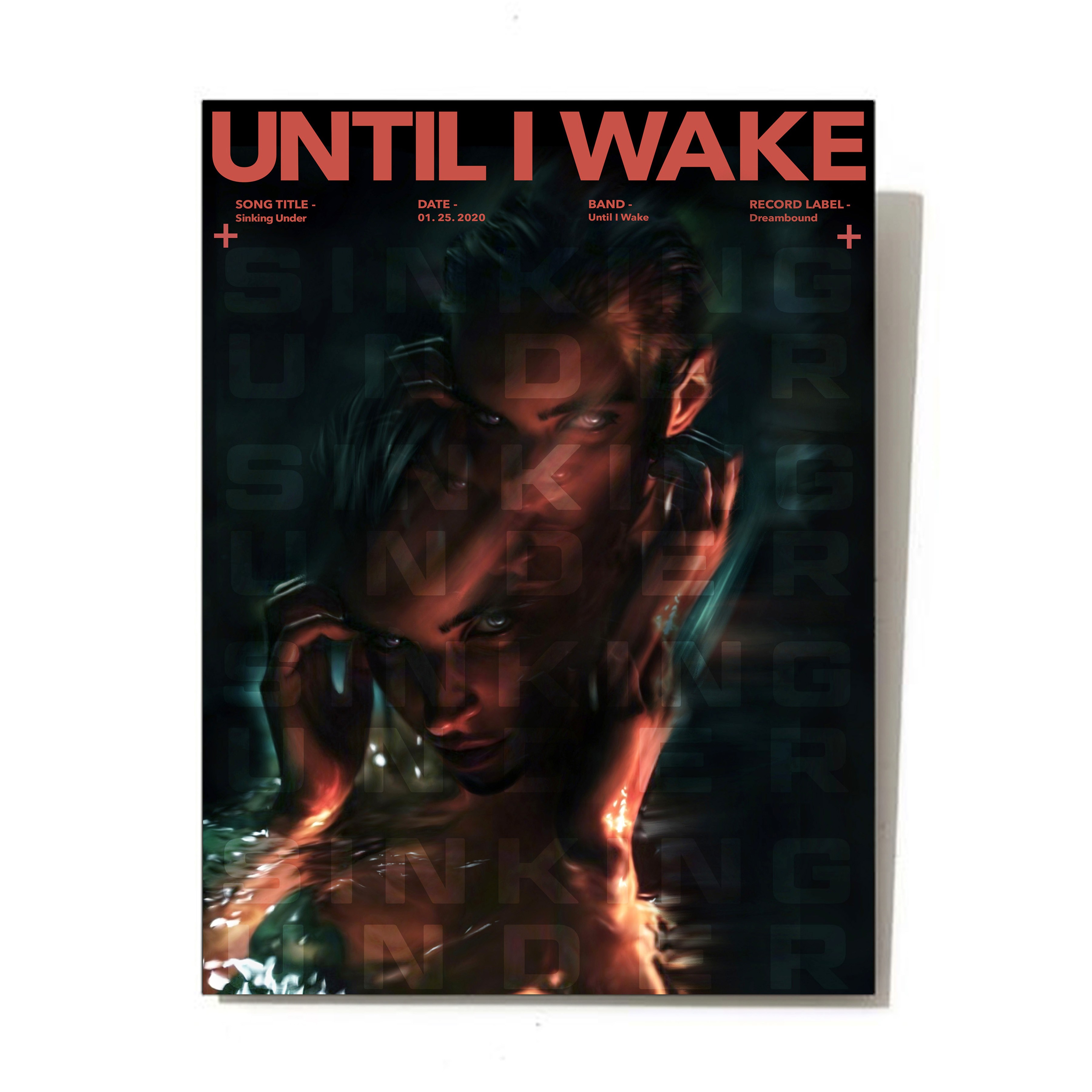
Until I Wake "Sinking Under" Promo Poster
Until I Wake "Sinking Under" Promo Poster
Until I Wake "Sinking Under" Promo Poster
Client
(unofficial) Until I Wake
Year
2020
Category
Promotional Art & Design
Research
Research
The research for the promo poster design for the band Until I Wake's single "Sinking Under" involved a deep dive into the band's music style, lyrical themes, and visual identity. Analysis of the song's lyrics, mood, and overall message provided insights into the tone and aesthetic direction for the poster. Additionally, studying successful promo posters for similar bands helped identify effective design elements and strategies. Exploring the band's existing branding materials and fanbase demographics informed decisions regarding imagery, typography, and color scheme.
The research for the promo poster design for the band Until I Wake's single "Sinking Under" involved a deep dive into the band's music style, lyrical themes, and visual identity. Analysis of the song's lyrics, mood, and overall message provided insights into the tone and aesthetic direction for the poster. Additionally, studying successful promo posters for similar bands helped identify effective design elements and strategies. Exploring the band's existing branding materials and fanbase demographics informed decisions regarding imagery, typography, and color scheme.
Research
The research for the promo poster design for the band Until I Wake's single "Sinking Under" involved a deep dive into the band's music style, lyrical themes, and visual identity. Analysis of the song's lyrics, mood, and overall message provided insights into the tone and aesthetic direction for the poster. Additionally, studying successful promo posters for similar bands helped identify effective design elements and strategies. Exploring the band's existing branding materials and fanbase demographics informed decisions regarding imagery, typography, and color scheme.
Design
Design
It features a captivating illustration that symbolizes the feeling of sinking or being overwhelmed, aligning with the song's title and lyrical content. The color palette is carefully chosen to evoke emotions such as melancholy, despair. Bold typography is used to prominently display the band's name and the single title, ensuring key information is communicated effectively. Overall, the design is impactful and memorable, drawing viewers in and enticing them to engage with the music.
It features a captivating illustration that symbolizes the feeling of sinking or being overwhelmed, aligning with the song's title and lyrical content. The color palette is carefully chosen to evoke emotions such as melancholy, despair. Bold typography is used to prominently display the band's name and the single title, ensuring key information is communicated effectively. Overall, the design is impactful and memorable, drawing viewers in and enticing them to engage with the music.
Design
It features a captivating illustration that symbolizes the feeling of sinking or being overwhelmed, aligning with the song's title and lyrical content. The color palette is carefully chosen to evoke emotions such as melancholy, despair. Bold typography is used to prominently display the band's name and the single title, ensuring key information is communicated effectively. Overall, the design is impactful and memorable, drawing viewers in and enticing them to engage with the music.
Development
Development
The development of the project began with conceptualizing ideas for the promo poster design for Until I Wake's single "Sinking Under." This involved brainstorming sessions to explore various visual concepts and compositions that would effectively capture the essence of the song's themes and mood. After settling on a concept, sketches and digital mock-ups were created to further develop the chosen design direction. These iterations allowed for experimentation with different visual elements, typography styles, and color palettes to find the most impactful and cohesive composition.
The development of the project began with conceptualizing ideas for the promo poster design for Until I Wake's single "Sinking Under." This involved brainstorming sessions to explore various visual concepts and compositions that would effectively capture the essence of the song's themes and mood. After settling on a concept, sketches and digital mock-ups were created to further develop the chosen design direction. These iterations allowed for experimentation with different visual elements, typography styles, and color palettes to find the most impactful and cohesive composition.
Development
The development of the project began with conceptualizing ideas for the promo poster design for Until I Wake's single "Sinking Under." This involved brainstorming sessions to explore various visual concepts and compositions that would effectively capture the essence of the song's themes and mood. After settling on a concept, sketches and digital mock-ups were created to further develop the chosen design direction. These iterations allowed for experimentation with different visual elements, typography styles, and color palettes to find the most impactful and cohesive composition.
More Works More Works
More Works More Works
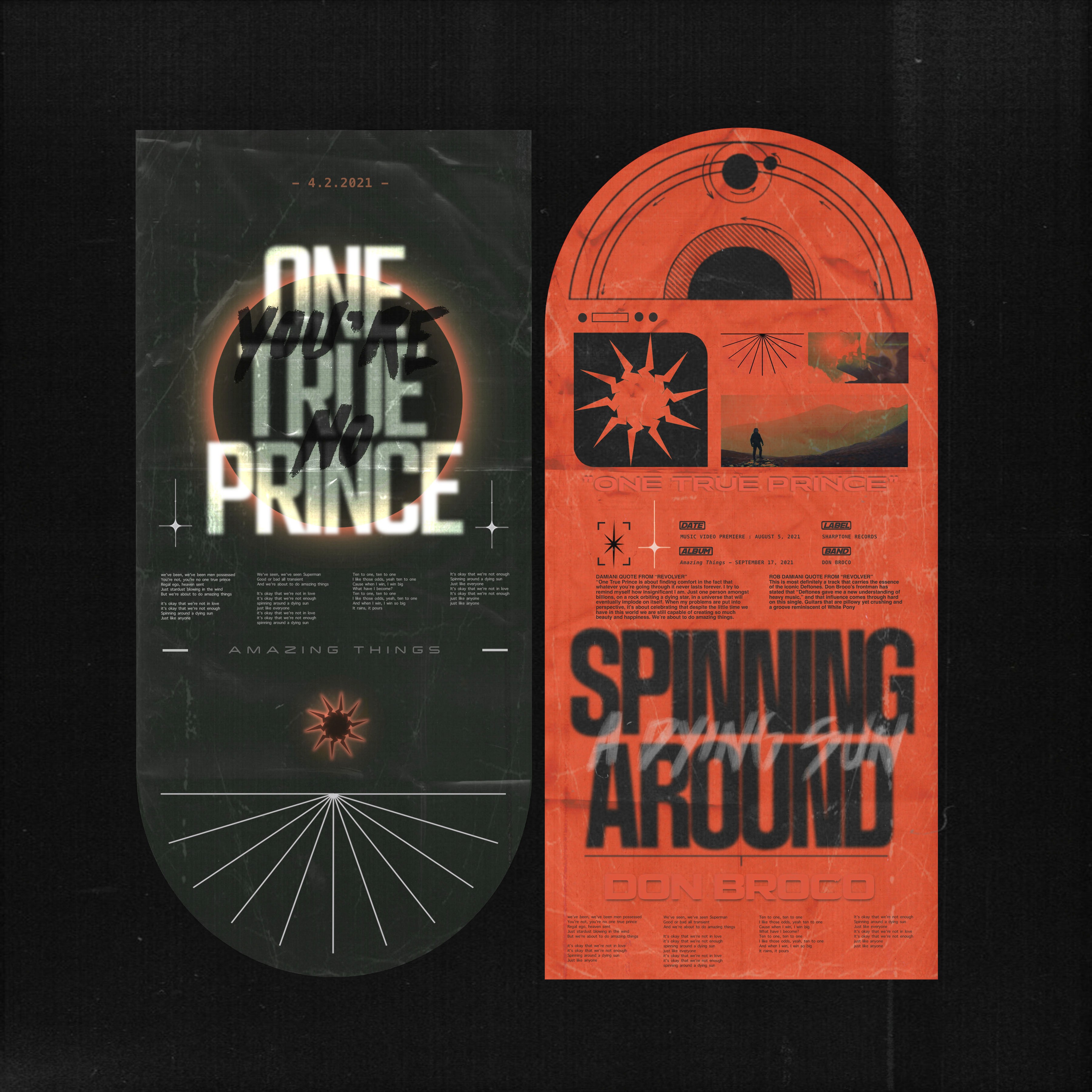
Don Broco "One True Prince" Promo Poster
Promotional Art & Design
2021
Don Broco "One True Prince" Promo Poster
Promotional Art & Design
2021
Don Broco "One True Prince" Promo Poster
Promotional Art & Design
2021
Don Broco "One True Prince" Promo Poster
Promotional Art & Design
2021
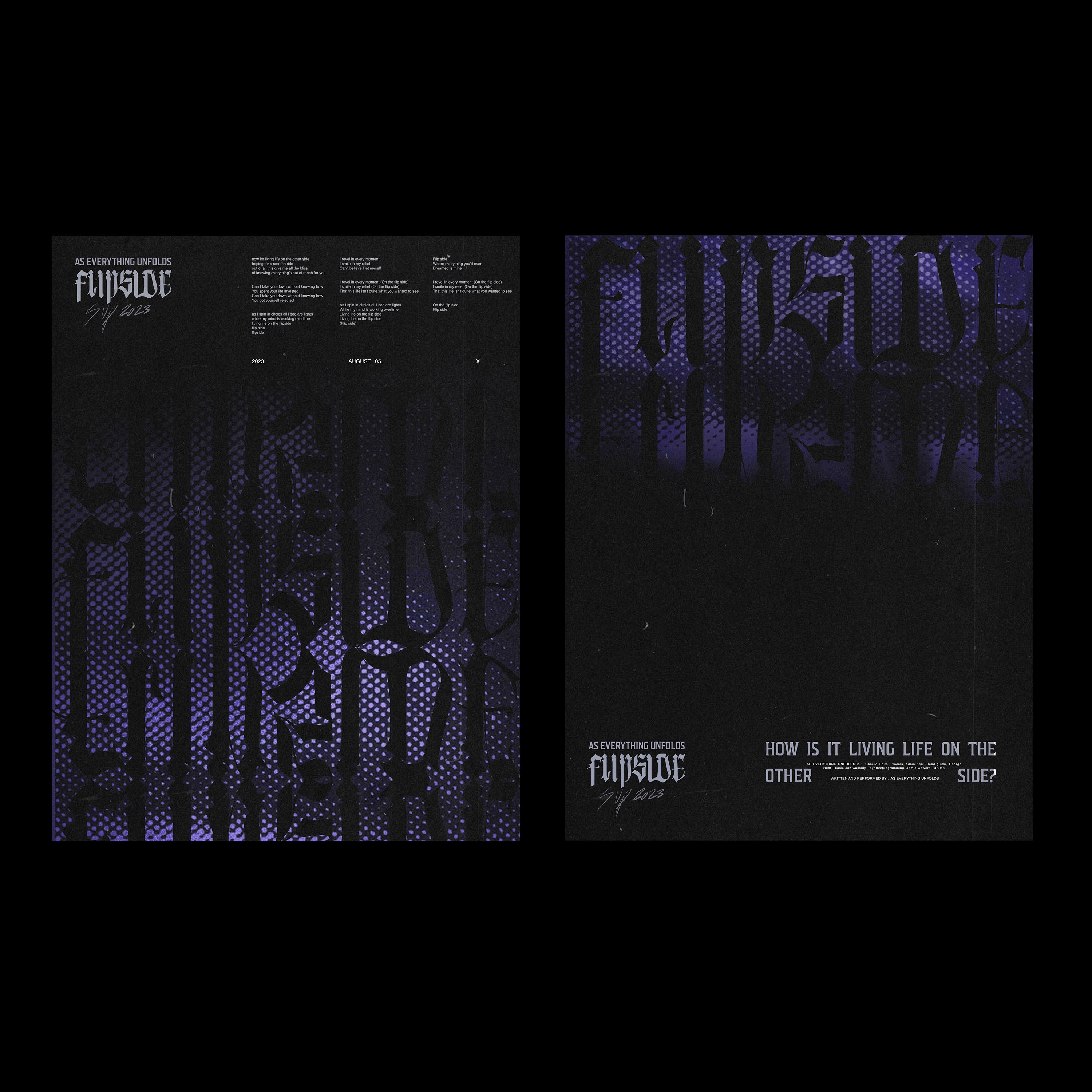
As Everything Unfolds "Flip Side" Promo Poster
Promotional Art & Design
2023
As Everything Unfolds "Flip Side" Promo Poster
Promotional Art & Design
2023
As Everything Unfolds "Flip Side" Promo Poster
Promotional Art & Design
2023
As Everything Unfolds "Flip Side" Promo Poster
Promotional Art & Design
2023
©MMV
GO BACK TO TOP
©MMV
GO BACK TO TOP
©MMV
GO BACK TO TOP
©MMV
GO BACK TO TOP