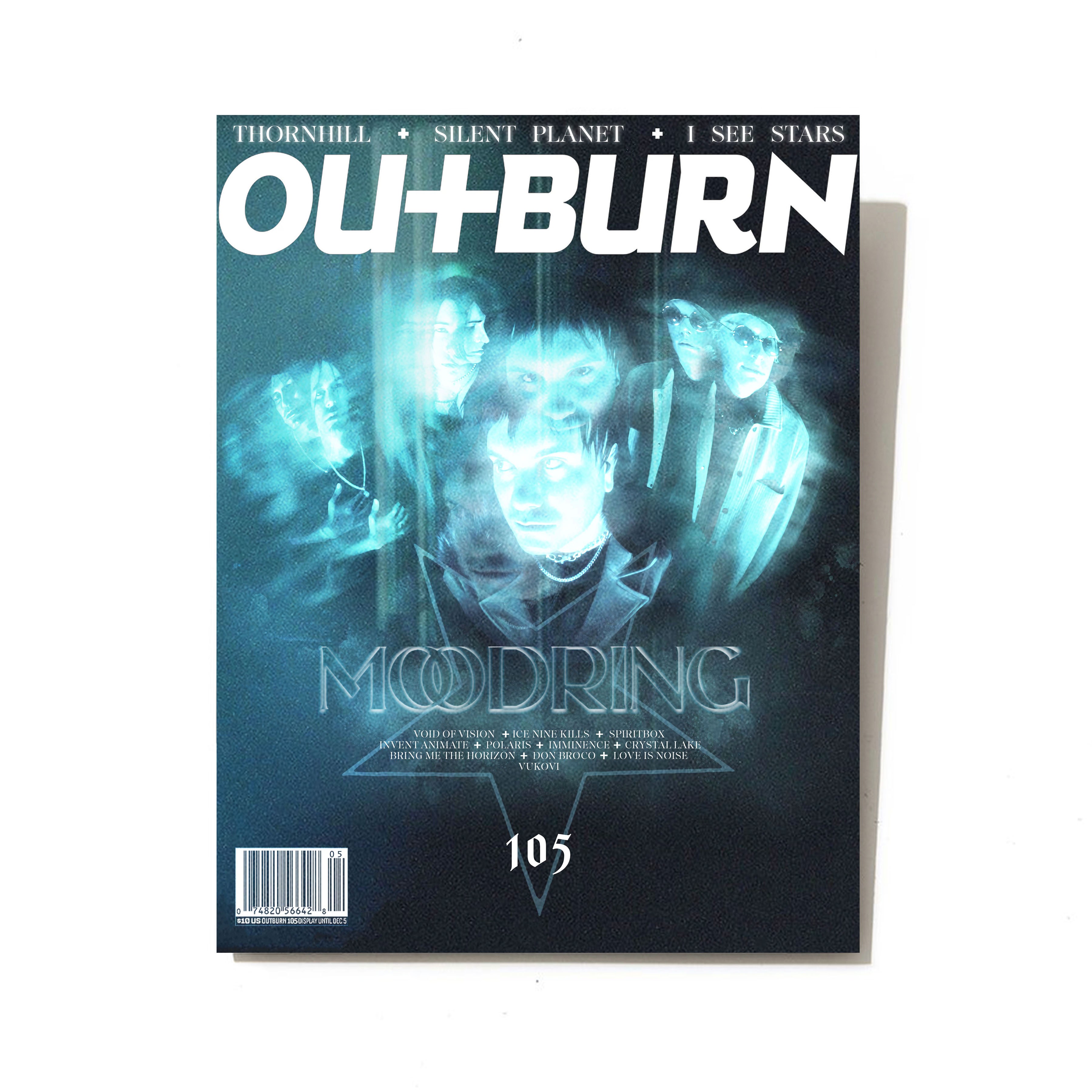
Outburn Magazine Cover Design ft. Moodring
Outburn Magazine Cover Design ft. Moodring
Outburn Magazine Cover Design ft. Moodring
Client
(unofficial) Upset
Year
2022
Category
Editorial Design
Research
Research
The research for creating a magazine cover for OUTBURN featuring Moodring as a passion project involved in-depth exploration of both the magazine's style and Moodring's aesthetic. Studying previous issues of OUTBURN provided insights into its layout, typography, and visual themes, ensuring alignment with the publication's overall vibe. Additionally, extensive research into Moodring's music, image, and fanbase was conducted to capture their essence accurately on the cover. Analyzing Moodring's previous media appearances and artistic direction helped in understanding their preferred visual representation. Overall, the research phase aimed to blend OUTBURN's established style with Moodring's unique identity to create a captivating and authentic magazine cover.
The research for creating a magazine cover for OUTBURN featuring Moodring as a passion project involved in-depth exploration of both the magazine's style and Moodring's aesthetic. Studying previous issues of OUTBURN provided insights into its layout, typography, and visual themes, ensuring alignment with the publication's overall vibe. Additionally, extensive research into Moodring's music, image, and fanbase was conducted to capture their essence accurately on the cover. Analyzing Moodring's previous media appearances and artistic direction helped in understanding their preferred visual representation. Overall, the research phase aimed to blend OUTBURN's established style with Moodring's unique identity to create a captivating and authentic magazine cover.
Research
The research for creating a magazine cover for OUTBURN featuring Moodring as a passion project involved in-depth exploration of both the magazine's style and Moodring's aesthetic. Studying previous issues of OUTBURN provided insights into its layout, typography, and visual themes, ensuring alignment with the publication's overall vibe. Additionally, extensive research into Moodring's music, image, and fanbase was conducted to capture their essence accurately on the cover. Analyzing Moodring's previous media appearances and artistic direction helped in understanding their preferred visual representation. Overall, the research phase aimed to blend OUTBURN's established style with Moodring's unique identity to create a captivating and authentic magazine cover.
Design
Design
The design for the magazine cover of OUTBURN featuring Moodring is a captivating blend of both OUTBURN's signature style and Moodring's unique aesthetic. Originally I fused two images together of the band that I had digitally painted. Seeing as how in the current realm of alternative magazines they focus on these blurred multi-image photographs, I wanted to show that illustrators can also recreate the same effect and still have a place in the editorial industry. . Moodring's distinct visual identity is prominently featured, complemented by bold typography and dynamic graphic elements that command attention. The composition is carefully balanced to create visual impact while maintaining a sense of cohesion with OUTBURN's established design language. Overall, the design aims to intrigue and captivate audiences, effectively spotlighting Moodring within the pages of OUTBURN magazine.
The design for the magazine cover of OUTBURN featuring Moodring is a captivating blend of both OUTBURN's signature style and Moodring's unique aesthetic. Originally I fused two images together of the band that I had digitally painted. Seeing as how in the current realm of alternative magazines they focus on these blurred multi-image photographs, I wanted to show that illustrators can also recreate the same effect and still have a place in the editorial industry. . Moodring's distinct visual identity is prominently featured, complemented by bold typography and dynamic graphic elements that command attention. The composition is carefully balanced to create visual impact while maintaining a sense of cohesion with OUTBURN's established design language. Overall, the design aims to intrigue and captivate audiences, effectively spotlighting Moodring within the pages of OUTBURN magazine.
Design
The design for the magazine cover of OUTBURN featuring Moodring is a captivating blend of both OUTBURN's signature style and Moodring's unique aesthetic. Originally I fused two images together of the band that I had digitally painted. Seeing as how in the current realm of alternative magazines they focus on these blurred multi-image photographs, I wanted to show that illustrators can also recreate the same effect and still have a place in the editorial industry. . Moodring's distinct visual identity is prominently featured, complemented by bold typography and dynamic graphic elements that command attention. The composition is carefully balanced to create visual impact while maintaining a sense of cohesion with OUTBURN's established design language. Overall, the design aims to intrigue and captivate audiences, effectively spotlighting Moodring within the pages of OUTBURN magazine.
Development
Development
The development of the magazine cover for OUTBURN featuring Moodring involved initial brainstorming to determine the overall aesthetic. Multiple design iterations were created, considering OUTBURN's style and Moodring's image. Fine-tuning details like color schemes and typography ensured visual coherence. Adherence to OUTBURN's brand guidelines was maintained throughout the process and was mocked up. The result was a visually striking cover that effectively showcased Moodring's identity within OUTBURN's context.
The development of the magazine cover for OUTBURN featuring Moodring involved initial brainstorming to determine the overall aesthetic. Multiple design iterations were created, considering OUTBURN's style and Moodring's image. Fine-tuning details like color schemes and typography ensured visual coherence. Adherence to OUTBURN's brand guidelines was maintained throughout the process and was mocked up. The result was a visually striking cover that effectively showcased Moodring's identity within OUTBURN's context.
Development
The development of the magazine cover for OUTBURN featuring Moodring involved initial brainstorming to determine the overall aesthetic. Multiple design iterations were created, considering OUTBURN's style and Moodring's image. Fine-tuning details like color schemes and typography ensured visual coherence. Adherence to OUTBURN's brand guidelines was maintained throughout the process and was mocked up. The result was a visually striking cover that effectively showcased Moodring's identity within OUTBURN's context.

More Works More Works
More Works More Works
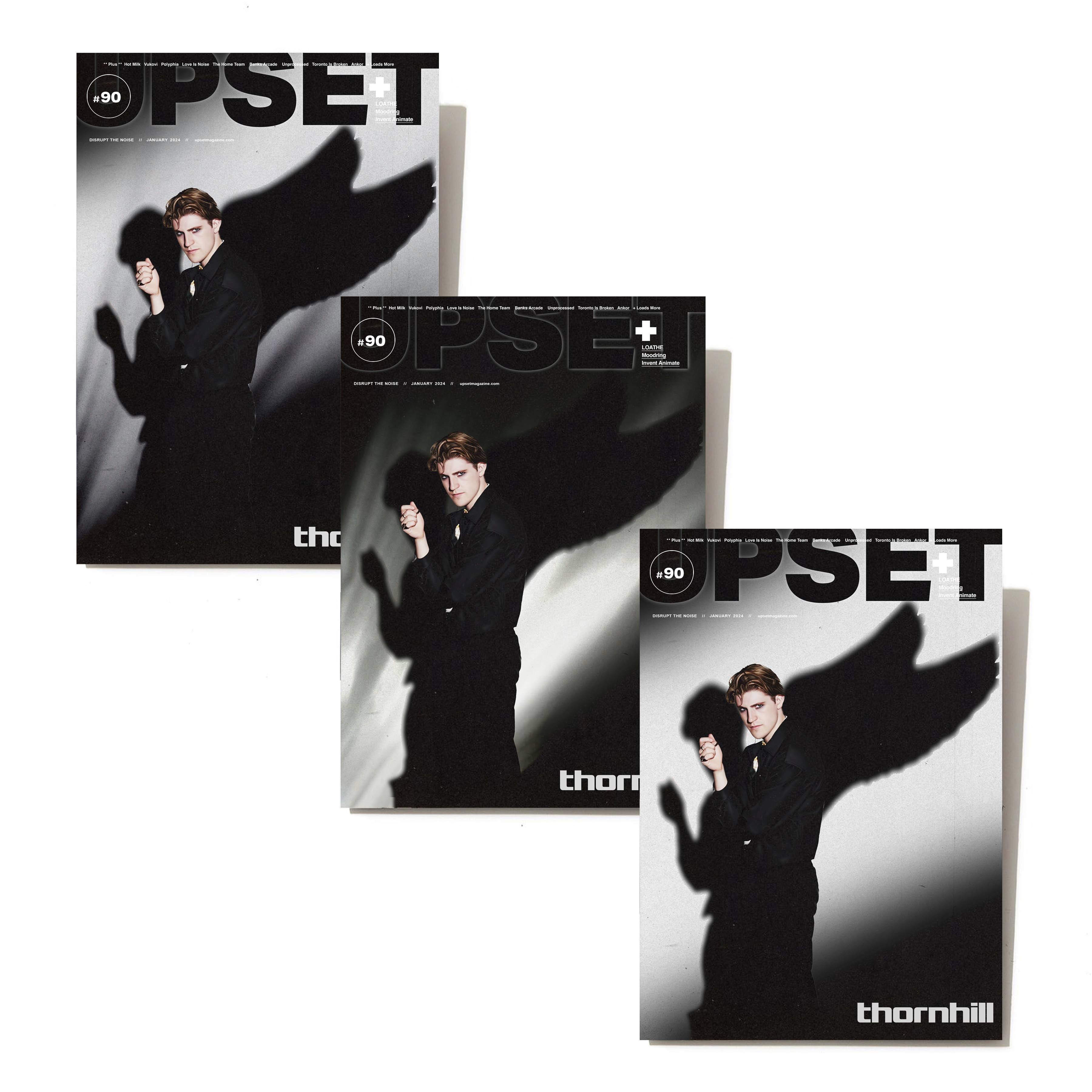
Upset Magazine Cover Design ft. Thornhill
Editorial Design
2023
Upset Magazine Cover Design ft. Thornhill
Editorial Design
2023
Upset Magazine Cover Design ft. Thornhill
Editorial Design
2023
Upset Magazine Cover Design ft. Thornhill
Editorial Design
2023
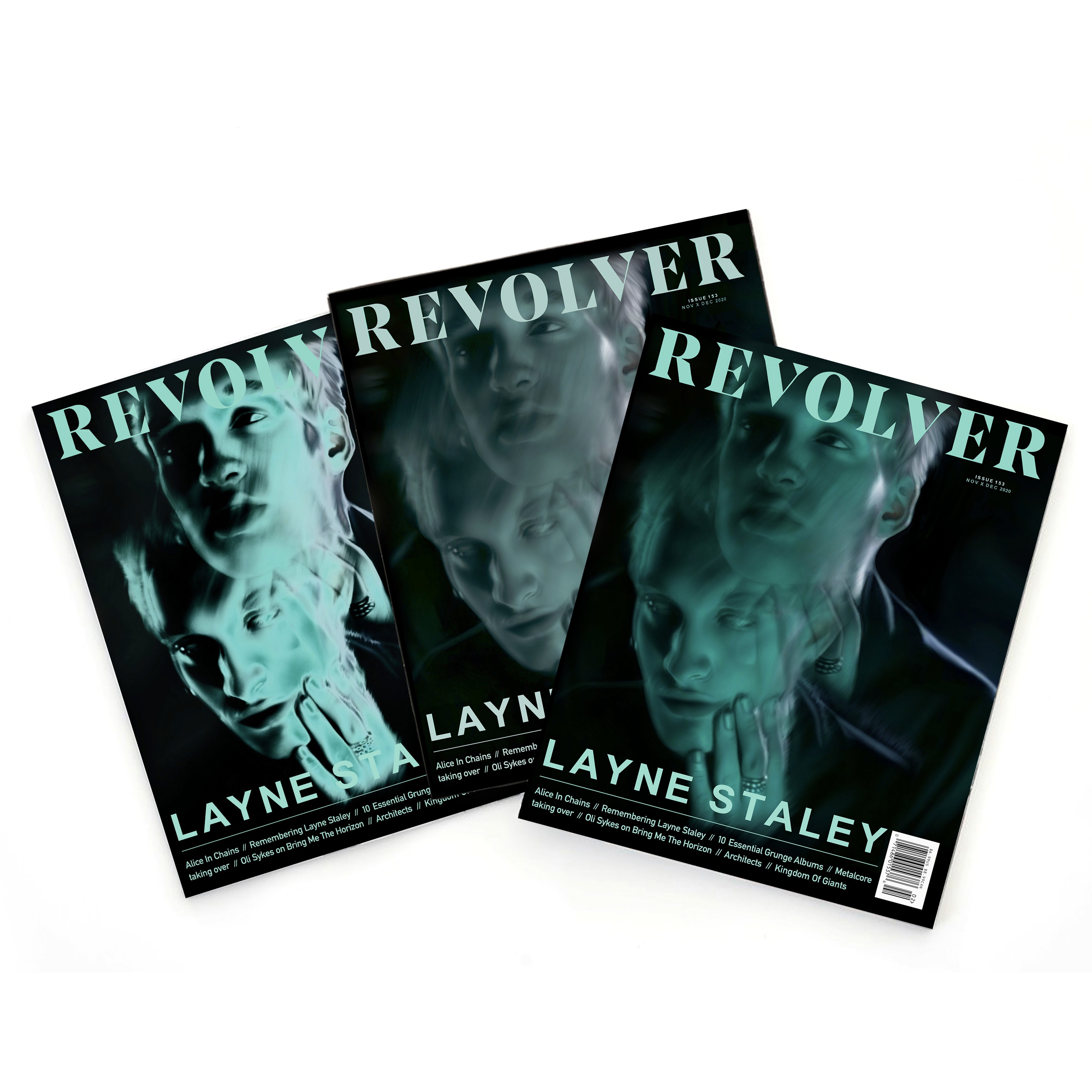
Revolver Magazine Cover Design ft. Layne Staley
Editorial Design
2021
Revolver Magazine Cover Design ft. Layne Staley
Editorial Design
2021
Revolver Magazine Cover Design ft. Layne Staley
Editorial Design
2021
Revolver Magazine Cover Design ft. Layne Staley
Editorial Design
2021
©MMV
GO BACK TO TOP
©MMV
GO BACK TO TOP
©MMV
GO BACK TO TOP
©MMV
GO BACK TO TOP